PROBLEM

SOLUTION DEMO
1. Integrated product traceability form
When posting a product online, farmers provide product's information. These are shown along in the product listing so farmers can prove their products quality with data.
2. Self-managed online store
Farmers open their own store and set their own prices, cutting out middlemen and reaching buyers directly. FarmLink handles verification so farmers focus on selling.
3. Streamlined order management
Farmers receive, confirm, and track every order in one place, reducing missed sales and confusion from indirect farmer-buyer communication.
LET'S BACKTRACK THE PROCESS
🔎 Competitor Analysis
To understand the market, we analyzed existing similar platform including UberEats, EASI, DoorDash. Here, we evaluate the strengths, weakness, UX design and business models.
Key findings:
Lack of farm-level data and real traceability features.
Too feature-heavy and text-dense for farmers that have limited smartphone literacy.
Most promote large-scale distributors, not with smallholder farmers.


📍 Mapping Pain Points
From the interviews with 15 small-mid size farmers, here are what we found:
📌 Identify MVP Features
We used the affinity mapping to organize the gathered informations. We group the problem areas into themes that help us to address “How might we?".
How might we make the process easy for farmers to manage their sales independently?
How might we improve farmers product distributions to buyers without barrier in trust?
✏️ Design & Build
We visualized small farmers' core flows interacting with the app into rapid sketch and then Figma prototypes.
Design Iteration 1
What I Tried?
A grid-based layout of products.
What Went Wrong?
Although this layout could scale to many products, however…
High item density created visual clutter.
Minimal product details slowed quick recognition.

Design Iteration 2
What I Tried?
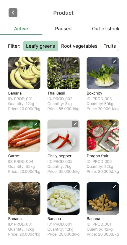
Richer product card details (ID, quantity, price) to improve inventory awareness.
What Went Wrong?
Although this improved product recognition, however…
Filter chips couldn't scale sufficiently as product categories grew.
Status tabs without counts left inventory numbers invisible at a glance.
Final Design
What I Tried?
Replaced filter chips with a dropdown and added product counts to each status tab.
Why it worked?
Dropdown scales cleanly as product categories grow over time.
Users get a clear snapshot of their full inventory on first load.

🤖 Code with AI
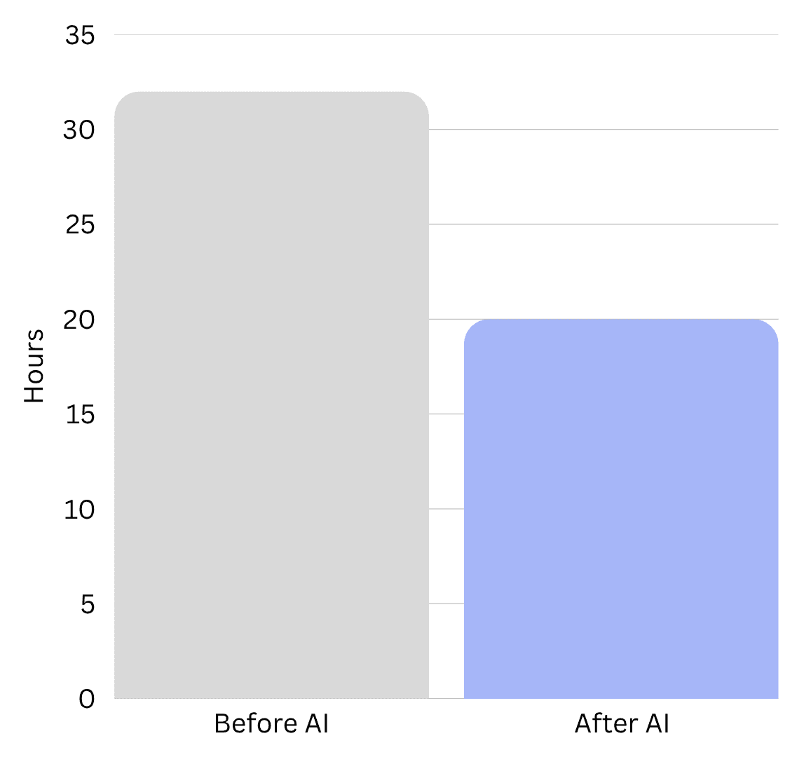
Figma MCP Server and VSCode Co-pilot significantly improved our workflow, accelerating MVP development while maintaining strong design quality and user experience.
Average hours to code 1 screen's UI

WHAT I LEARNED
🎭 Wearing multiple hats
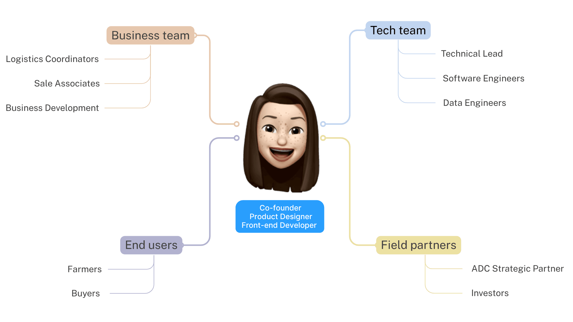
Being the founder meant stepping into every role. Beyond shaping the visions. I worked with others to make decisions on product priorities, and iterated quickly based on real feedback from farmers and ADC partners.
I also managed the technical foundation, from Figma design systems to React Native development. Outside engineering, I handled business strategy, budgeting, partnerships, and market positioning, learning to balance speed with sustainability.
This experience taught me how to think end-to-end, from vision and UX to engineering, operations, and growth strategy.
Let's
design
build
create
together
© 2026 Hayley Nguyen