PROBLEM
The users struggle to find support
Through discussions with Crisis Center stakeholders, we identified the website made it difficult for users due to:
Unclear navigation
Users struggled to understand where to look for relevant services and resources
Weak visual hierarchy
Important information lacked emphasis, making pages difficult to scan and next steps unclear
Outdated visuals
The website needed a more cohesive, welcoming design that reflected the Center’s supportive mission
Limited responsiveness
The interface did not adapt well across screen sizes, making resources harder to access on mobile devices
Define THE scope
Expectations
Stakeholders wanted a complete website redesign and implementation
Constraints
3 months, approximately 10 hours per week, and no funding
Design, frontend, and backend within the same timeline
Stakeholder meetings once every two weeks
To balance stakeholder expectations with team capacity, we focused on the Home and Resources pages, responsive layouts, and design system.

VIsual identity
The original website retained the Crisis Center recognizable blue identity, but offered limited visual distinction between content and actions.


I expanded the palette with navy for emphasis, soft blue and warm neutrals for a welcoming tone, and coral to highlight key actions.

Design VERSIONS
Homepage
Original

Limited information about the Center’s services
Similar colors and button styles gave urgent support little visual distinction from other actions
Redesign
Also include services, community impact, and stories
Stronger visual hierarchy and a contrasting “Get Help Now” button give urgent support greater emphasis
Resources page
Original
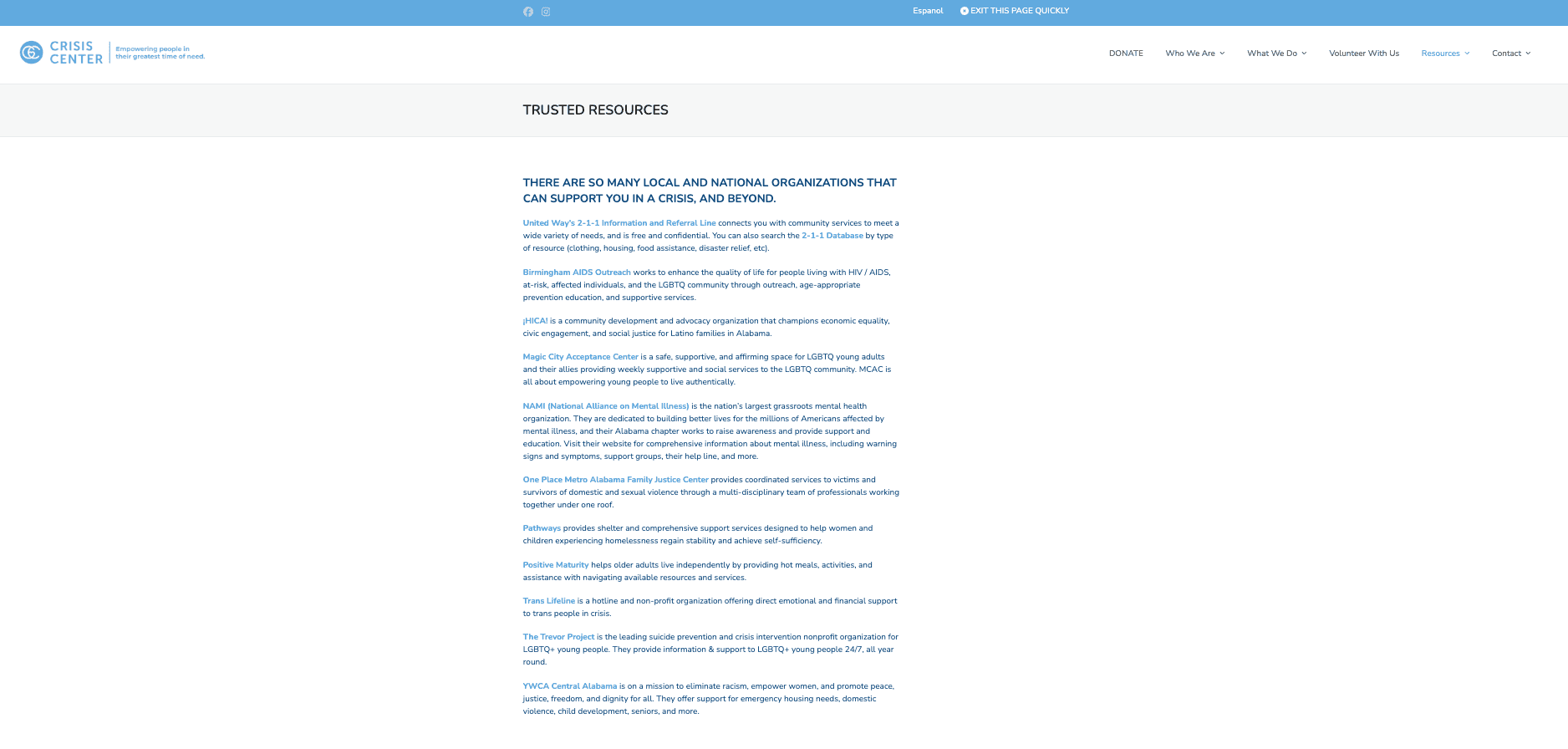
Resources appeared as a continuous list. Visitors had to scan each entry to identify relevant support
Redesign
The resources organized into topic categories, keyword search and filters. Consistent resource cards make options easier to scan
ai in the workflow
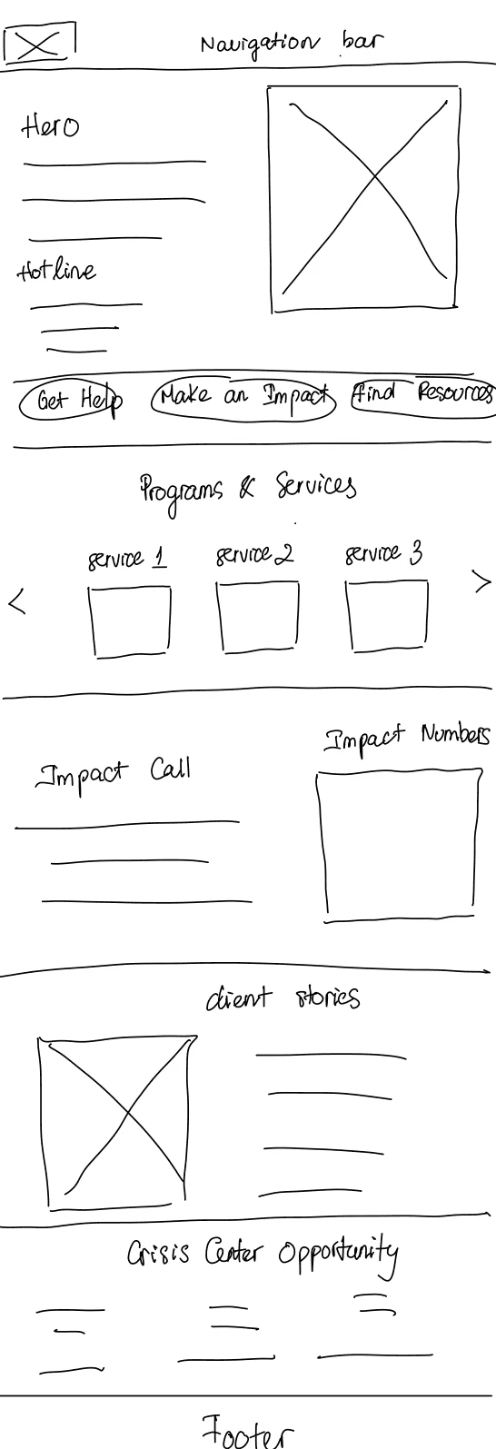
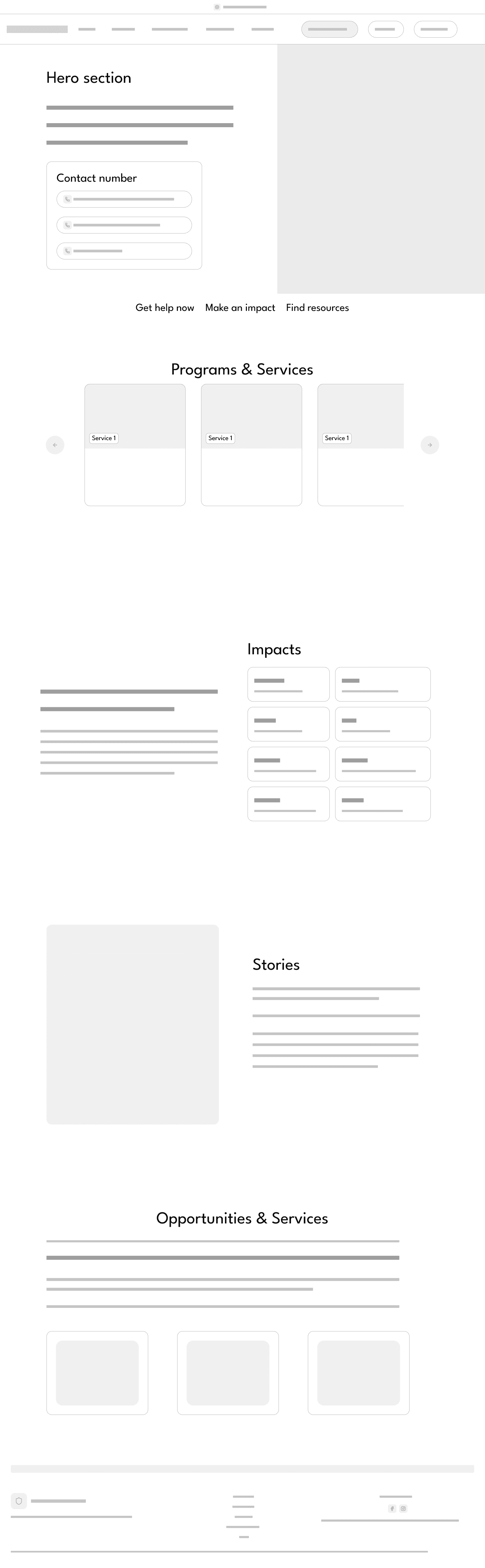
With limited time, I used AI to turn my sketch into a wireframe, enabling early stakeholder feedback and faster iteration before development.
Rapid sketch
High-fidelity wireframe (AI generated)
Final design


reflection
Validate beyond stakeholder feedback
💬
With more time, I would conduct usability testing and refine the design based on their feedback and task completion.
Big shoutout to my team that made the work worth it! 🫶🏻

Let's
design
build
create
together
© 2026 Hayley Nguyen