Duration
July, 2025
Roles
UI/UX Designer
Developer
Colaborations
Neuroscientists
Challenge
Neuroscientists have to write complex queries to generate node-graph visualizations of gene relationships. This is a steep learning curve, especially for researchers without query-writing experience.
FINAL PRODUCT DEMO
✅ Researchers can generate complex gene graphs through simple search instead of writing Cypher queries.
✅ The real-time, interactive 3D visualization enables faster pattern recognition and helps uncover meaningful relationships.
✅ Gene details, relationships, and visual context are consolidated in one place, reducing context switching and accelerating hypothesis validation.
HOW WE APPROACH THE PROBLEM SPACE
📍 Mapping Pain Points
As we interview with the neuroscientsists, we see the common pain points among them:

Room for errors

"Even when it works, I’m never fully confident the query is doing exactly what I intended."

✍🏻 Rapid Sketching
We dropped some ideas and rapid sketching to visualize “how do we solve the problems?"
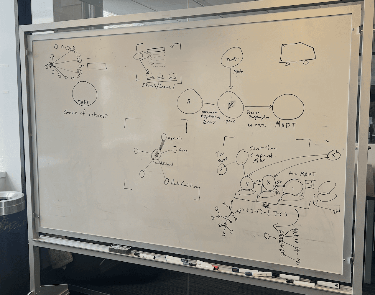
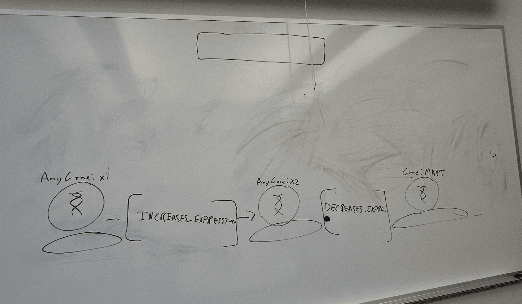
Here, we see 2 main opportunities to enhance research efficiency:
🔎
Replace the necessity for writing queries with a search box that enables users to look up gene connections.
🧬
Enable direct interaction with the data by allowing scientist to click, drag, and explore a 3D visualization of gene connections, facilitating continuous interaction.
✏️ Design Iterations
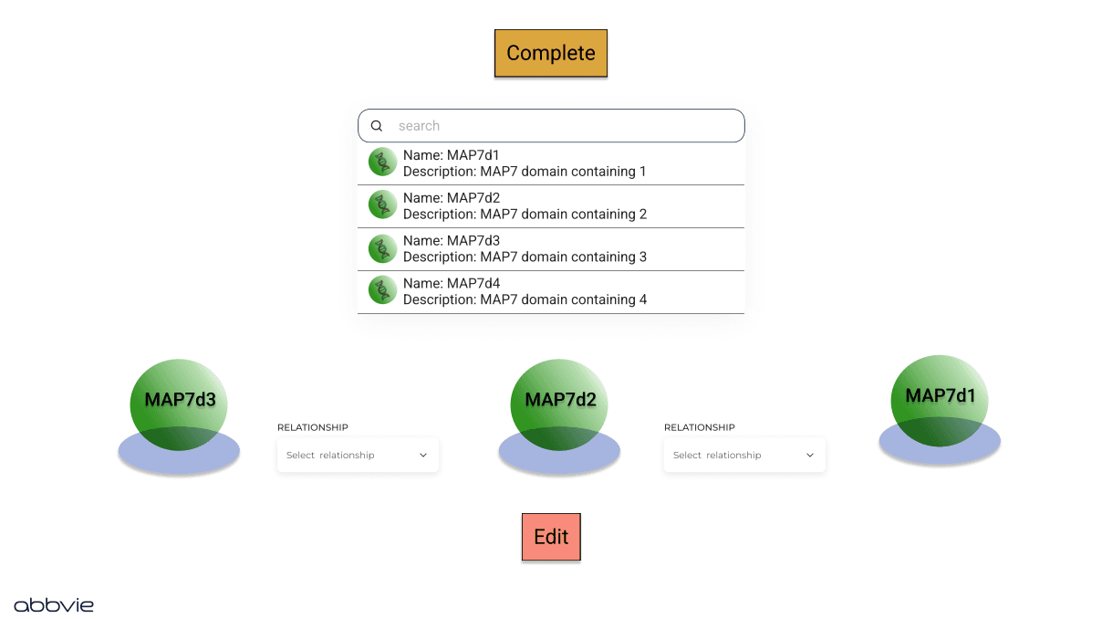
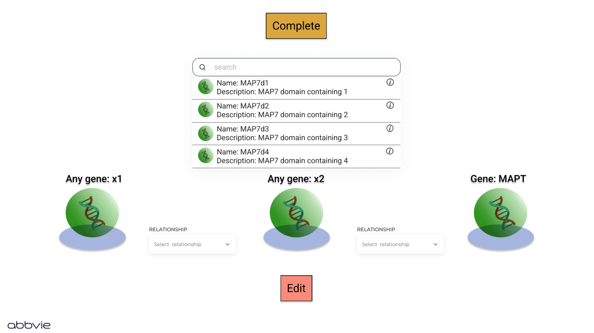
Design Iteration 1
What I Tried?
I tested a design where users select a placeholder, then choose a gene to fill that position. Users could also define relationships between genes and view basic gene details on hover.
What Went Wrong?
Users didn’t intuitively understand the two-step interaction of selecting a placeholder first and then choosing a gene, which caused confusion and slowed down the workflow. The neuroscience team also needed access to more detailed gene information.
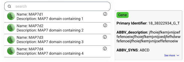
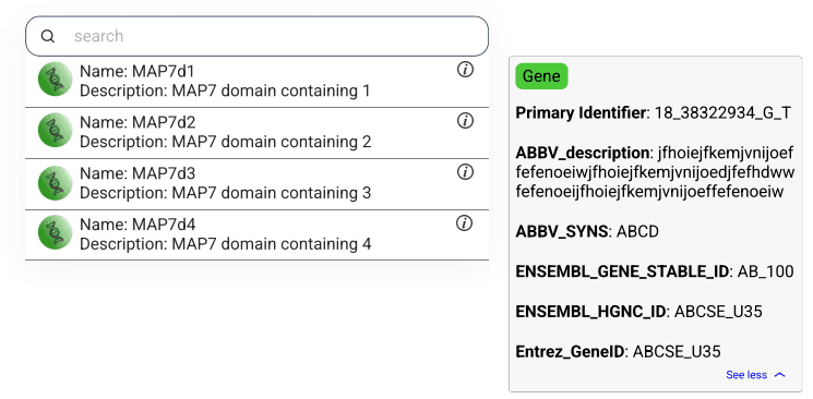
Design Iteration 2
What I Tried?
Allowed users to click a gene and drag it directly into the placeholder to create a continuous workflow. I also added gene-type visuals inside each sphere and moved the gene name to the top for quicker identification. Additional gene details were included to help users better understand each selection.
What Went Wrong?
Removing the confusing two-step interaction from the first design made the workflow more intuitive. The clearer visuals, repositioned gene names, and additional gene details also helped neuroscientists identify the right genes more quickly and aligned better with their expectations for how the interaction should work.
HOW I GREW THROUGH THIS PROJECT
Simplifying complex workflows creates the biggest impact
Users don’t need more features, they need less friction. Streamlining complicated steps can dramatically improve efficiency in any domain
🧩
✉️ Kind words from my manager
"From the moment Hayley joined our team, it was evident that she possessed an exceptional level of commitment and enthusiasm. Even before her official start date, she proactively prepared herself for the role, demonstrating her eagerness to contribute effectively. Throughout her internship, Hayley consistently exhibited a strong work ethic and a genuine passion for her field."

Ryan Chandler
Knowledge Graph Engineer, AbbVie

Let's
design
build
create
together
© 2026 Hayley Nguyen