Duration
Sept - Nov, 2024
Roles
UI/UX Designer
Colaborations
UI/UX Designers
Overview
A student-powered food delivery app that lets solo diners join live group orders with other students nearby, splitting the delivery fees so you never have to overpay for a single meal again.
PROBLEM
College students often face the frustrating dilemma when it comes to food delivery: either place a large enough order to offset the high delivery fee, or pay a steep price for a small, single meal. Whether the restaurant is five miles away or just one, the delivery fees often remain the same.
SOLUTION DEMO
Solo diners can join group orders with other students nearby.
Students can join or host the live group orders with other students (whom they don't know). This helps split the cost between solo diners flexibly
All orders have transparent delivery pricing, so students know if they’re overpaying for a short-distance delivery
LET'S BACKTRACK THE PROCESS
🟨 Affinity Diagraming
To validate the ideas, I conducted user research with 16 students within my school campus to understand their needs, behaviors, and motivations.
After collecting all the data through the interviews with the target users, I sort them into groups of similar items to synthesize the key patterns, user needs, and pain points.

🔎 Competitor Analysis
To understand the market, we analyzed existing food delivery platform (UberEats, EASI, DoorDash) to know more about the current experience of users.
Here, we evaluate the strengths, weakness, UX design and business models.
Key findings 🔑
Most apps are optimized for general users, overseeing the students needs.
While 'group order' features exist, they typically assume social connections.
Users may find it difficult to understand how total costs are calculated.

📍 Mapping Pain Points
As we walk through the insights, we see the common pain points among the student users:

No share & save

"I'd do group order, but at the time I want to order, I can't find anyone around me to do group ordering. I always have to do it alone and end up paying high fees."

🧩 How Might We…?
To move from insights to solutions, we turned each major pain point into an opportunity for solutions:
🍱
How might we help solo diners optimize the fees without placing a large order?
👥
How might we connect users with others nearby at anytime?
📍
How might we make delivery fees seem fairer?
✏️ Design Iterations
I tested my design solution with the same users I interviewed with and their feedbacks allow more insights that gives valuable design iterations.

Design Iteration 1
What I Tried?
A simple view list of nearby group orders that is sorted by the countdown timers until the order is closed.
What Went Wrong?
This helped with quick scan, however…
Not every user knows the location of the pick-up point. Users need to go to map app to search for a specific location which is overwhelming if there are multiple orders
Users prefer to sort orders in distance rather than time windows

Design Iteration 2
What I tried?
Added an in app map and pick up distance from user's current location.
Added the filter or sorting options (distance, time window, cost) that with the minimum number.
Why it worked?
Users can scan quickly based on preferences and easily know the pick-up location without the need to navigate to other apps, minimizing the process of searching.
WHAT I LEARNED
Finding gaps in mature markets
As the app grew to handle more live details and moving pieces, the interface got complicated quickly. Managing all of this taught me how to display a lot of information on a single screen without overwhelming the user. My biggest takeaway was learning how to clean up the noise so the final experience feels clear, easy, and effortless to scan.
🧩
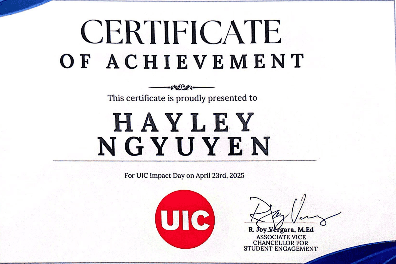
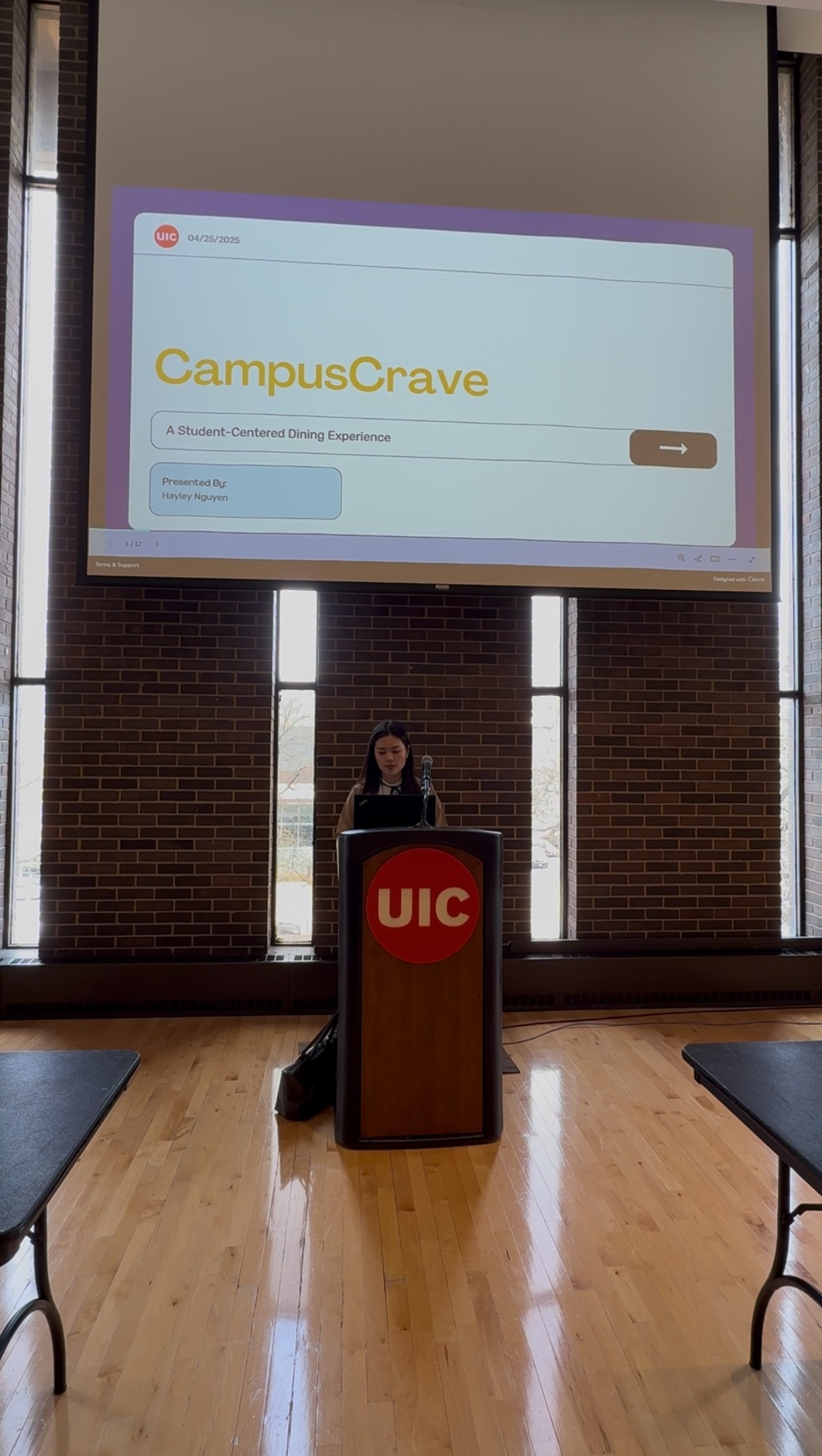
🏅 Recognized as 'Impactful Project' at University of Illinois at Chicago


Let's
design
build
create
together
© 2026 Hayley Nguyen